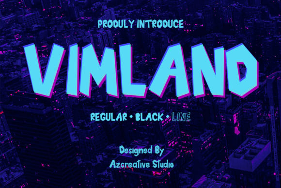
Vimland: A Modern Display Font for Web Design
I was stuck on the hero section of a new portfolio site for a tech-forward creative agency. The client wanted something that screamed "future" without feeling cold or sterile. I had tried three different modern typography options, but they all felt too generic. That’s when I decided to test Vimland. As soon as I loaded the file into my design software and typed out the main headline, the screen seemed to shift. This isn't just another bold typeface; it is a statement piece designed to command attention in a crowded digital landscape.
For anyone involved in web design, finding the right display font can make or break a landing page. Vimland immediately stood out because of its thick, bold lettering and distinct techno-styled architecture. It feels like it was built for the digital age, offering a visual weight that translates perfectly from desktop monitors to mobile screens. In this review, I want to walk you through how Vimland performs in real-world layouts, where it shines, and how you can integrate it into your brand identity effectively.
The Visual Impact of Vimland in Hero Sections
The first thing you notice about Vimland is its presence. It is a heavy hitter in terms of visual hierarchy. When I placed it over a dark gradient background for a SaaS product launch page, the contrast was immediate and striking. The thick strokes of the letters create a solid block of color that anchors the entire composition. Unlike many decorative fonts that lose their definition at larger sizes, Vimland maintains its structural integrity, making it an excellent choice for large-scale headlines.
In the context of logo design or primary navigation titles, this font offers a unique personality. It bridges the gap between industrial strength and modern sleekness. If you are designing a campaign landing page for a gaming app, a crypto startup, or even a high-end fashion boutique looking for an edgy twist, Vimland provides that necessary "wow" factor. It tells the user immediately that this brand is confident and current. However, because it is so dominant, it works best when used sparingly. Letting it breathe with ample whitespace allows the techno-style details to be appreciated rather than overwhelming the viewer.
Performance in Responsive Layouts and Mobile Views
One of the biggest concerns with bold display fonts is how they render on smaller screens. During my testing, I resized the browser window to simulate various mobile devices. Vimland held up remarkably well. The kerning and spacing are tight enough to look intentional but open enough to remain legible on a smartphone screen. This is crucial for responsive design, where every pixel counts.
I tested the font in a few different scenarios: as a full-width header on a tablet view and as a stacked title on a vertical mobile layout. In both cases, the thick letterforms did not suffer from pixelation or blurring. For designers creating digital brand kits, knowing that your primary typeface scales down gracefully is a massive relief. It ensures that the brand message remains consistent whether a user is browsing on a 27-inch monitor or scrolling through Instagram on their phone. Just be mindful of line height; because the letters are tall and thick, you may need to increase the leading slightly to prevent the lines from colliding visually on compact screens.
Strategic Font Pairing for Better Readability
While Vimland is powerful, it is not designed for long-form reading. Attempting to use it for body copy would be a recipe for poor user experience and accessibility issues. Instead, the secret to using Vimland effectively lies in smart font pairing. I found that pairing this techno-styled display font with a clean, neutral sans serif font created a perfect balance. The simplicity of the body text allowed the complexity and weight of Vimland to shine without causing visual fatigue.
If you are aiming for a more editorial or sophisticated look, a classic serif font could also work well as a secondary typeface, creating a juxtaposition between the old and the new. However, avoid pairing it with other heavy display fonts or overly ornate script fonts; the result will likely be chaotic. Stick to simple, geometric sans serifs for paragraphs, buttons, and navigation menus. This approach ensures that while Vimland grabs the attention, the rest of the content guides the user smoothly through the page. This combination is essential for maintaining a strong brand identity while keeping the site functional and accessible.
Best Use Cases for Digital Products and Branding
Vimland excels in specific areas of digital creation. It is ideal for:
- Landing Page Headlines: Where conversion relies on immediate impact.
- Call-to-Action Buttons: Short phrases like "Get Started" or "Join Now" pop beautifully in this typeface.
- Social Media Graphics: Thumbnails and promotional images need to stop the scroll, and Vimland does exactly that.
- Digital Course Headers: Giving sections of an online course a bold, structured feel.
- Online Store Banners: Highlighting sales or new arrivals with authority.
I recently used it for a mock-up of a coaching website's "About" section header. The boldness conveyed confidence, which is exactly what a potential client wants to see. It also worked wonders on a series of digital ads where the text needed to be readable within seconds. The techno aesthetic gives it a versatility that spans industries, from tech and finance to lifestyle and entertainment, provided the application is thoughtful.
Technical Considerations and Licensing
Before integrating Vimland into any live project, there are practical steps to take. First, check the included file formats. For web implementation, having access to optimized webfonts (like WOFF2) is critical for fast loading times. No one wants a beautiful font that slows down their site speed. Ensure the package includes these formats if you plan to host them directly or use a CDN service.
Next, review the licensing agreement carefully. As a commercial font, you must ensure you have the right permissions to use it on websites, especially if you are building sites for clients or selling digital templates. Some licenses restrict usage based on traffic volume or require additional fees for embedding on multiple domains. Also, check for multilingual support if your audience is global. While Vimland is primarily designed for Latin characters, verifying the character set is vital for international projects. Finally, look for alternates or ligatures that might add a unique touch to your design assets without requiring extra downloads.
When to Avoid Using Vimland
To maintain professional standards, it is equally important to know when not to use Vimland. Because of its heavy weight and decorative nature, it should never be used for:
- Long paragraphs of body text.
- Small navigation links or footer information.
- Form labels or input fields where clarity is paramount.
- Interfaces requiring high accessibility compliance for low-vision users, unless carefully tested.
Using a display font in these contexts can hinder usability and frustrate visitors. Remember, good UI design prioritizes the user's ability to consume information quickly. Vimland is the spotlight, not the stage lighting. Keep it reserved for moments where you need to make a dramatic entrance or emphasize a key value proposition.
Ultimately, Vimland is a fantastic addition to a designer's toolkit. It brings a sense of modernity and strength to digital projects that often lack character. By respecting its limitations and leveraging its bold personality in the right places, you can create web experiences that are not only visually stunning but also highly effective. Whether you are launching a new product or rebranding an existing site, giving Vimland a try in your next hero section might just be the upgrade your design needs.